TABLE OF CONTENTS
- Introduction To Dashboard (Home)
- 1. Select SSID.
- 2. Aggregate Child
- 3. Wi-Fi Online Devices
- 4. Rays
- 5. Speed test
- 6. Network Performance
- 7. Coverage Map
- Coverage map understandings
Introduction To Dashboard (Home)
The Ray Dashboard screen is the landing of page post login.
The screen has the below elements.
1. Select SSID.
The dashboard screen shows data per SSID.
Select the SSID from the drop-down for which you want to see the Dashboard data.

2. Aggregate Child
This is a boolean toggle.
Enabling Aggregate Child toggle includes the data from all the Child clusters of the given cluster.
Disabling the Aggregate Child which is the default state gives the data from only this cluster.

3. Wi-Fi Online Devices

This shows the devices connected to the selected SSID.
It splits the devices in both 2.4 Ghz and 5 Ghz.
4. Rays

This shows the total number of Rays configured for this Cluster.
5. Speed test

This tile shows the last speed test result performed on this cluster.
You can trigger an "On Demand" speed test by clicking the Run Speed Test.
6. Network Performance

This tile shows the results of the last Network Performance test performed on this cluster.
You can trigger an "On Demand" Network Performance test by Clicking Run Performance Test.
7. Coverage Map
Coverage remains the key reason for Wi-Fi devices not getting enough Quality.
The Coverage Maps show the Wi-Fi signal received by each device connected to the Ray.
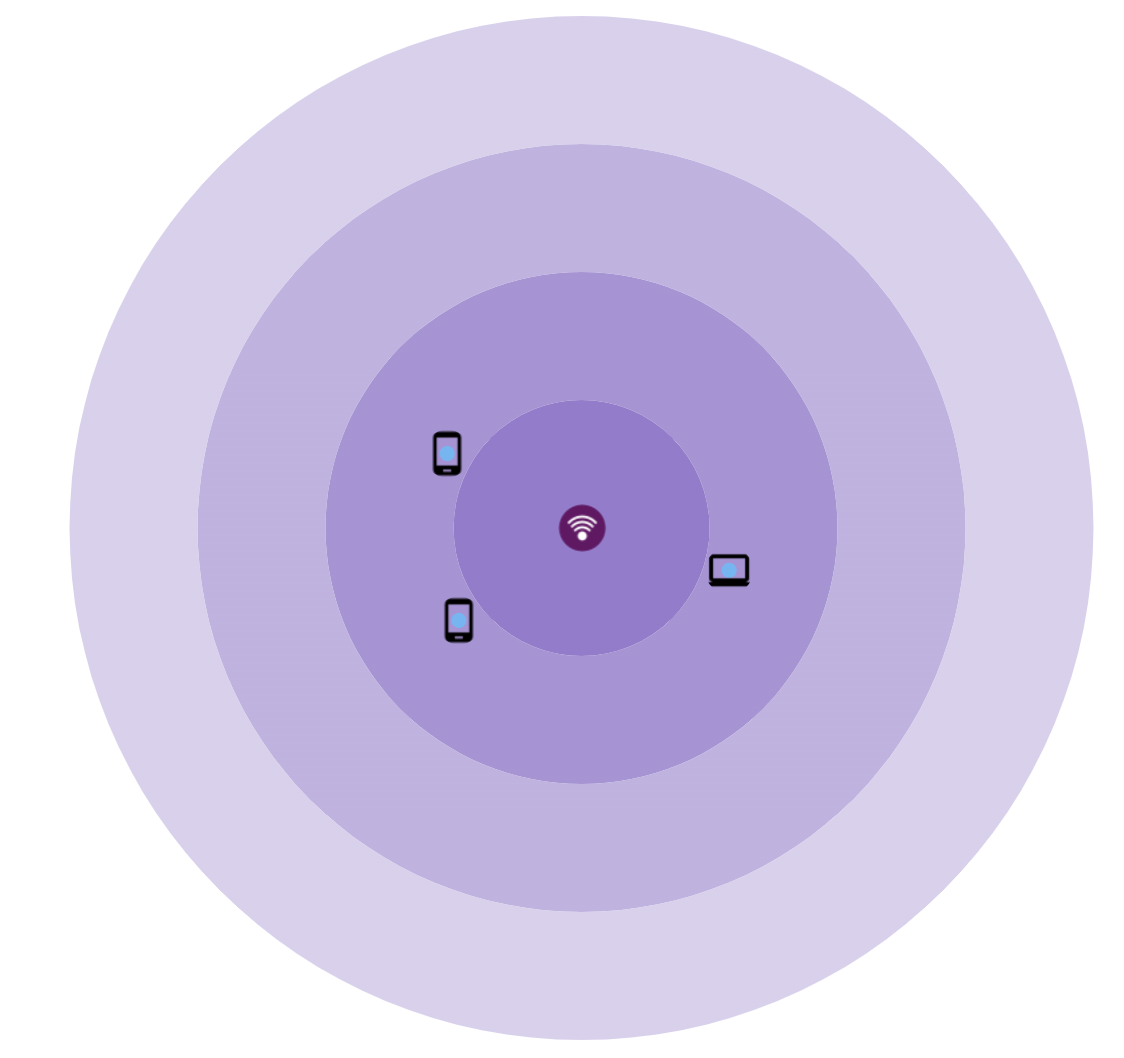
Coverage map understandings
The map is divided into 4 signal categories going inside out,
Excellent, Good, Average, and Poor.
The chart represents the data in form of icons to represent computers, Android phones & Apple devices.
IoT devices support is in roadmap.
The view can also be switched to a pie chart view.

The dBm conversion of the same is as below.
Excellent : Upto -30 dBm
Good : -31 dBm to -67 dBm
Average : -68 dBm to -70 dBm
Poor : -71 dBm to -80 dBm
Unusable. : -81 and above
Thank You
Ray Support